The Top 10 Design Rules You Need For Your Home
- mydenlife
- Oct 26, 2023
- 7 min read
About to start updating your home? Got your Pinterest boards on the go? Just not sure how to pull it all together or where to start? It's very rare, as an interior designer, that I meet someone that doesn't know what they like in reality. It's just how you get from that idea in your head to putting it all together in a room right? Well there are some tried and tested design rules that can be used to help you on your way. Read on to get the low down on what you need to consider to make your room tip top.


1: Achieving Balance. That's that special something that can make your room feel perfect. Nothing jumping out at you, nothing feeling like it shouldn't live there just perfect, calmness. Almost like it's always been this way.
So the key here is achieving equilibrium in the room , through colour, texture, furniture sizes and layouts. There are a few rules designers use to achieve this such as the Golden Ratio, considering symmetry and asymmetry, but perhaps the simplest is the Rule of Thirds.
Take a shot of your room with your phone camera and turn on the grid lines. These lines split the image into a 3x3 grid. You then use this grid to work out if your furniture and décor is balanced in the image. For example if you look at the fireplace in the image below, you would then assess if you have too much furniture on one side and it's making the room feel unbalanced. You can use this system when styling shelves or hanging art on a wall too.


2: Find the Harmony. This is all about creating a cohesive look by ensuring that all elements work together and have a common theme or style. That doesn't mean barbie-core or a nautical theme (unless that's really your thing) but more that you look at the colour combinations and that they work together and that your furniture sits well with each other (if it's eclectic then just ensure the wood tones and/or shapes in the room feel unified). Then look to arrange your furniture to allow good circulation within a space and ta-dah... a functional and comfortable layout.


3: Is Size Everything? When it comes to scale and proportion it's definitely worth paying attention to sizing. The aim is to maintain size relationships between furnishings and other elements to ensure a balance and that translates into a comfortable feel. You can also create a visual hierarchy by using scale, colour, and placement to guide the viewer's eye and emphasize specific focal points within a space. It is also a great way of indirectly moving the eye away from elements you are less keen on architecturally or visually.
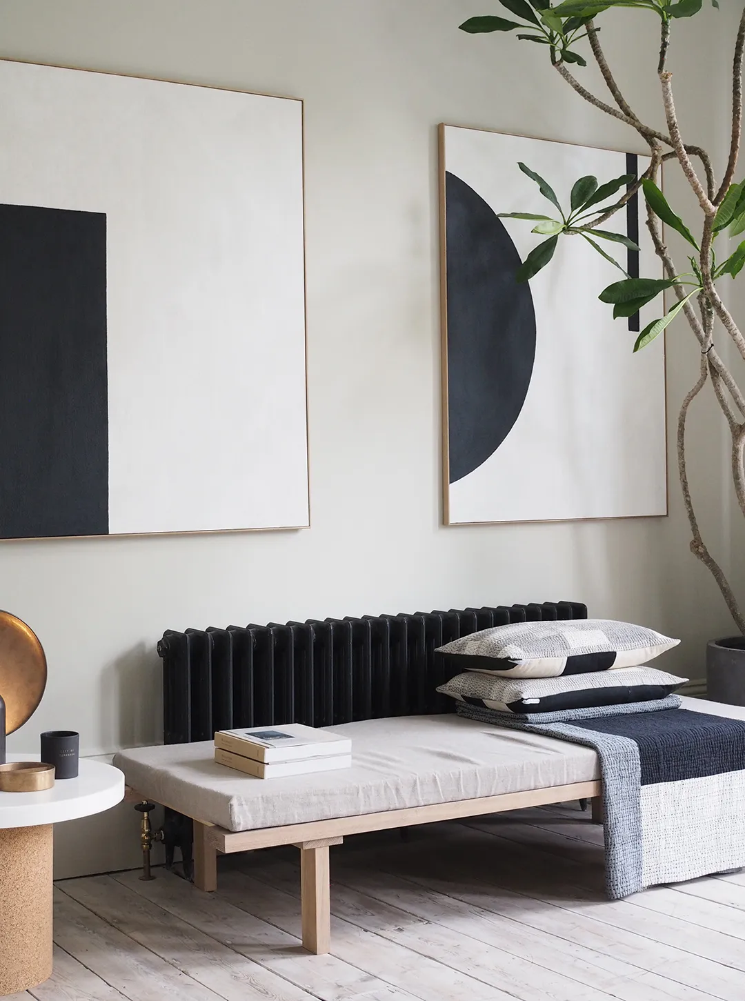


4: Repeat, Repeat, Repeat and then Contrast: By using contrasting elements such as colours, texture, or furniture/accessory sizes you can make certain elements stand out, and by incorporating repetition (from shapes in the room such as in the image below where they have used curves in the mirror, fireplace, sofa and cushions), to repetitive lighting and more ) you will establish a rhythm and consistency.


5: What Goes Where?: One of my favourites to add interest and personality to a space is creating vignettes. By grouping related objects together you can create a sense of unity and and it allows the viewer to easily perceive connections between elements. So think about a cabinet, photo frame and lamp next to an armchair or a collection of found (read scavenged) objects from a beach trip in a bell jar on the mantle piece. By creating vignettes within the room it also lets the eye fall and rest on individual areas of the room and adds character and interest to the space.


6: Depths of Character: Once you have a layout sorted, you can introduce added depth and dimension by layering elements such as rugs, furniture, accessories, and artwork to create a sense of visual interest. Make sure you incorporate a range of textures as this tactile variety will add depth and richness to the design and it plays to one of our key senses, touch. So from glints of metallics in light fittings and vases, soft throws and cushions, to natural materials in flooring and furniture you can build up your room to please your senses. But ensure you layer, layer, layer so think about artwork with a decorative item propped in front of it on a shelf or a throw and cushions on your sofa. Adding colour and texture helps add depth to the space.


7: Colour Therapy: We all know that different colours can affect moods and perhaps that's why when choosing a colour for your home it becomes so anxiety inducing to ensure you get it right. By understanding how colours interact and impact our mood we can start to use them effectively to set the mood in our homes. So what are the key takeaways you can use? Well its a multi faceted area of study but I have tried to cover some key takeaways that may help.
Firstly think about colours being grouped into warm and cool colours. Warm colours (reds, oranges, yellows) evoke energy, warmth, and excitement and are great to use in cool, north facing rooms to add warmth to the space. Cooler colours (blues, greens, soft purples) evoke calmness, tranquillity, and a sense of space.
Of course colour can be influenced greatly by neighbouring colours, lighting conditions, and surrounding elements. So thinking about colour harmonies can be helpful too. What does that mean you say? Well on a base level you can look at the following thinking:
Analogous: these colours are next to each other on the colour wheel and share similar undertones. And many of the paint companies out there will group their colours together tonally so you can select confidently across that range and know it will work.
Complementary: colours directly opposite each other on the colour wheel will create a strong contrast. This is a great way to add energy to a room or lift a darker space by adding interest.
Monochromatic: this is where you use variations of a single colour, using different tints, tones, and shades to layer up your space. Great for a serene, calm feel and also as a back drop to strong furniture designs or colours and eye catching artwork or accessories.


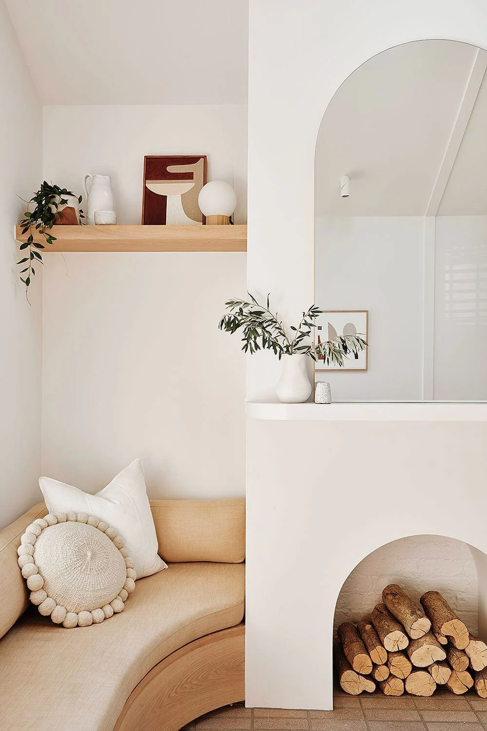
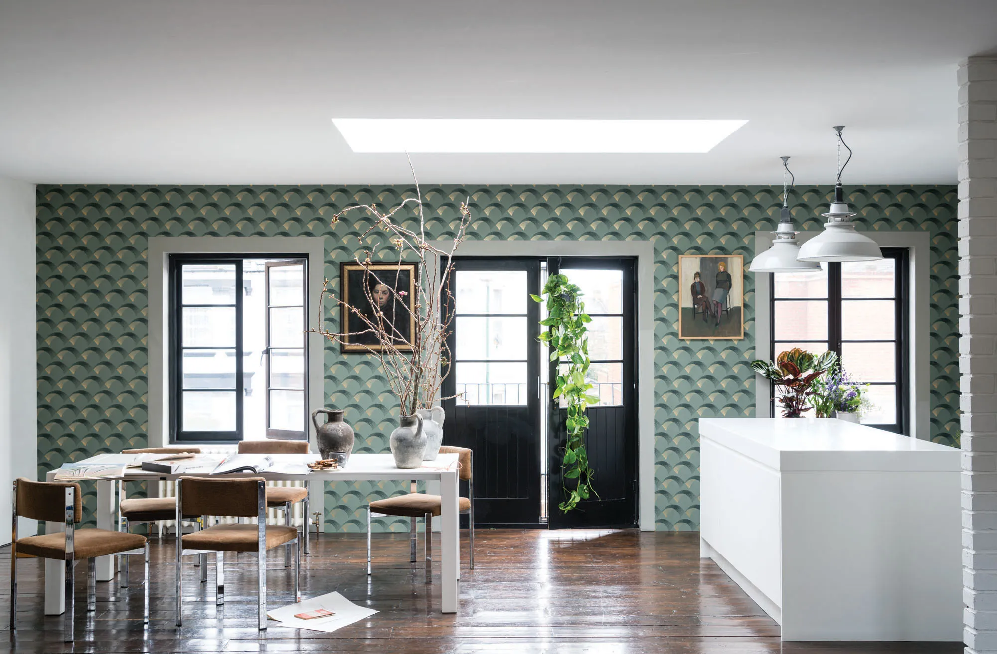
8: Finding focus and Negative Space: By using a focal point in a room you can draw the eye and anchor a room's design. To do this you would designate a main point of interest in the room and use that as the starting point for the viewer's eye. For example, central and right hand images below your eye is drawn to the dark green wall effect and the window/outside respectively.


But don't underestimate the brilliance of negative space (this is the empty areas in your room as shown in top left image here) as they intentionally give breathing room to design elements, enhance clarity, and create a sense of balance. Think about how much nicer a sparse but well laid out clothes store is compared to sale time at your high street store! So don't overfill your room either.

9: Let there be Light: By incorporating various lighting sources you will create different moods and highlight specific areas. This is probably one of the most important considerations in your room design. You really don't want to be settling down for a quiet night in front of the tv with a glaring overhead light for company. Nor do you want to darn your socks by lamplight... so be aware there are lights for everything. This is another huge area of design so my light touch here is just a starting point but should get you lit just right...

Every room will need layered lighting: consider what you need in each room from ambient (think lamps and low mood lighting), task (for concentrated work from chopping your veg to reading a book), and accent lighting (highlighting architectural elements, artwork or decorative elements). The combination of these creates a balanced and versatile lighting scheme which means that you will always feel comfortable whatever you are doing in the room.


Don't neglect natural light. I mean we all need as much natural light as we can possibly get and living in a Victorian house means I fight that battle on the home front. So find ways to maximize natural light by making sure your windows are unobstructed (and cleaned!), use strategically placed mirrors to reflect light, and light-coloured surfaces to bounce light around the room.


Finally don't forget the rules about scale and proportion here too. A large chandelier in a small room can overwhelm the space (but I always advocate going as large as you can with lighting in the space you have as it can add real drama), while a tiny fixture might get lost in a large room.
10. Bring on the Pattern: you can introduce tactile variety through different textures and patterns to add depth , personality and richness to the design. Don't panic there are some easy rules that can help you nail it confidently too.

Always consider the colours of the patterns and textures you are layering up. Think back to the colour wheel and coordinate your colours within the patterns with the overall colour scheme of the room to maintain a cohesive look. Or add an opposing complementary colour to add interest. When applying this to patterned wallpaper think about the effect you want to achieve from small scale prints on wall (pared back to big, blowsy prints (maximalist) to fully covering a room (high drama) you can really lift a space with pattern and colour.
Choose a mix of patterns in different scales (small, medium, large) and styles (geometric, floral, abstract) while ensuring they all share your common colour palette.
If you prefer a more understated approach, opt for subtle patterns in neutral tones and keep your use of pattern to your textiles such as curtains, cushions, bedding, and table linens. Mixing patterns in these areas can add visual interest without overwhelming the space.
Or incorporate patterned accent furniture, such as side tables or cabinets, to add an unexpected touch. Just don't be frightened, have a play and have fun with it.


So there we are, 10 key design rules that can elevate your home from blah to brilliant. Off you go!
And for any additional support then just drop me a line today for an informal chat on tor@denlife.co.uk
Sourced images: DEN LIFE interiors, Cate St Hill, DFS, House of Hackney, Farrow&Ball, Sanderson Design Group, Haymes Paint, Lisa Gilmore Design, Studio McGee, Light & Dwell, Alison Kist Interiors, Fresh Home Decors, Flea Market Insiders, Angela Steyn, Becki Owens, Paint&Paper Library, Houston Custom Carpets, PaperSnitch, James Merrel, Lisa Cohen, Emre Can Acer, VakkerLight, Royal Design, Nordic Lighting, Next, Bark & Chase, Pinterest Unknown, Sonnie Hiles, Homes to Love, Turner Architects, Devol Kitchens, Catherine Augustin, Charlotte May.


Comments